

Graphic design
Branding
A brand identity that stays the same on card, site, social and door. Colours, typography and rules for use.
Branding is the agreement about how you look. Not a moodboard that disappears in a drawer, but colours, typefaces and examples you can use again next time, even when we are not in the room.
We start with who you are and where the brand will really appear in the coming year. A café has a menu, a window, an apron and an Instagram tile. A software company has a site, a proposal and a deck. The style must work on those surfaces, not only on a presentation slide nobody opens later.
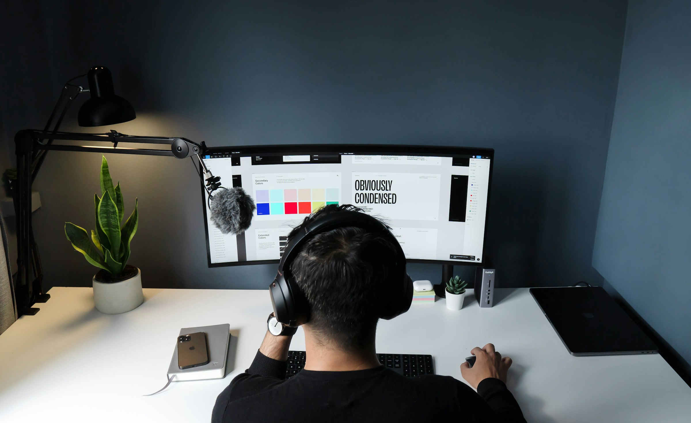
You get the building blocks: a palette that holds up in colour and in one colour, typography that stays readable in a small footnote, and the balance between logo, text and image. That comes with a short guide. What is allowed, what is not, and how someone else makes a new card without inventing a second brand.
That guide is the part that stays. Next year there is a new colleague, a new page, a new print run. If the agreement is clear, the line stays the same. If it is missing, every new piece drifts and after a few months the organisation looks like three agencies passed through.
Sharpening an existing style is possible too. We look at what people already recognise and what only became messy: too many colours, a typeface that fits nowhere anymore, a logo that sits differently on the site than on the invoice. Not everything needs redoing when the core is right and the edges rattle.
Waar het op neerkomt
Recognisable
Someone must recognise you on a small card and on a large poster.
Usable rules
What is and is not allowed with colour and logo. Short, not a book.
Carry through
The same line on print and on the site, if you do both with us.
Graphic design
Why a brand identity cannot stay with AI long term
A generator makes a mood image. A brand identity is the agreement that stays the same a year later, and the year after that. Every new prompt draws something new: different colour, different letter, different logo beside the text. Long term, card, site, door and invoice drift apart.
In many cases that looks cheap. Dated, a typeface that shows up everywhere, colours that shift on paper, and no rule a colleague can follow. The first image looks finished; the tenth piece looks like a different organisation.
Our craft is what remains: what you leave out, a palette that still works in one colour, and a short guide so someone else does not wreck the line. A generator does not deliver that, even when the first image looks expensive.
Branding
Talk about this
Tell us
No long story needed.
Just enough to get started.
Tap what applies. We reply personally, within 2 business days.