

Our work
Goth is HOT
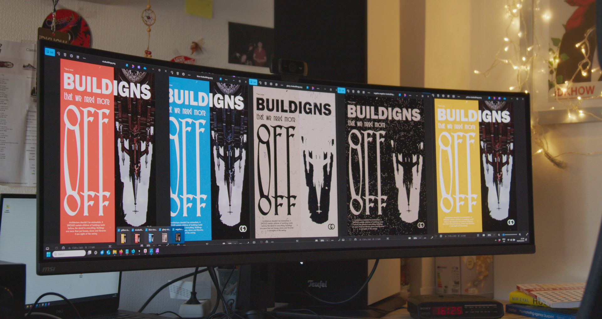
A self-set challenge with one photo and thirty minutes: from composition to a poster series with different moods, one message.
I gave myself a brief: one photo, thirty minutes, make something. Starting with only that image, I looked for the best composition, drawing on the familiar horror-house look from films and series, and a music video by IDKHOW.
Then I typed different lines and tried to turn them into something. What stuck was Buildings that we need more of: buildings today are often dull, and I love old architecture. I played with different fonts, warping type and colour until this composition felt right.
Once I was happy with that, I explored what happened when I added different effects. That is how the poster series grew: from heavy treatments to smooth ones you barely notice. Each poster slightly different, each with its own mood. The message stays the same throughout.
What I took from this is that sometimes you just have to try: it can be very easy, or very hard. And you do not always have to stay inside the box. A short deadline and one starting image force quick decisions on composition, typography and mood, then deliberate variation until the series works as a whole. You see what lands before you lock in a single version. That is how I approach client work too: set the core first, explore with intent, commit only when it is right.
Also see
Shooting movement & color
A shoot where movement and colour carry the image. The camera follows what moves, and colour stays consistent from the first shot to the edit.
Studenten en cultuur Event
An event for students and culture, captured while the day went on. Atmosphere, people and the moments that belonged to the programme.